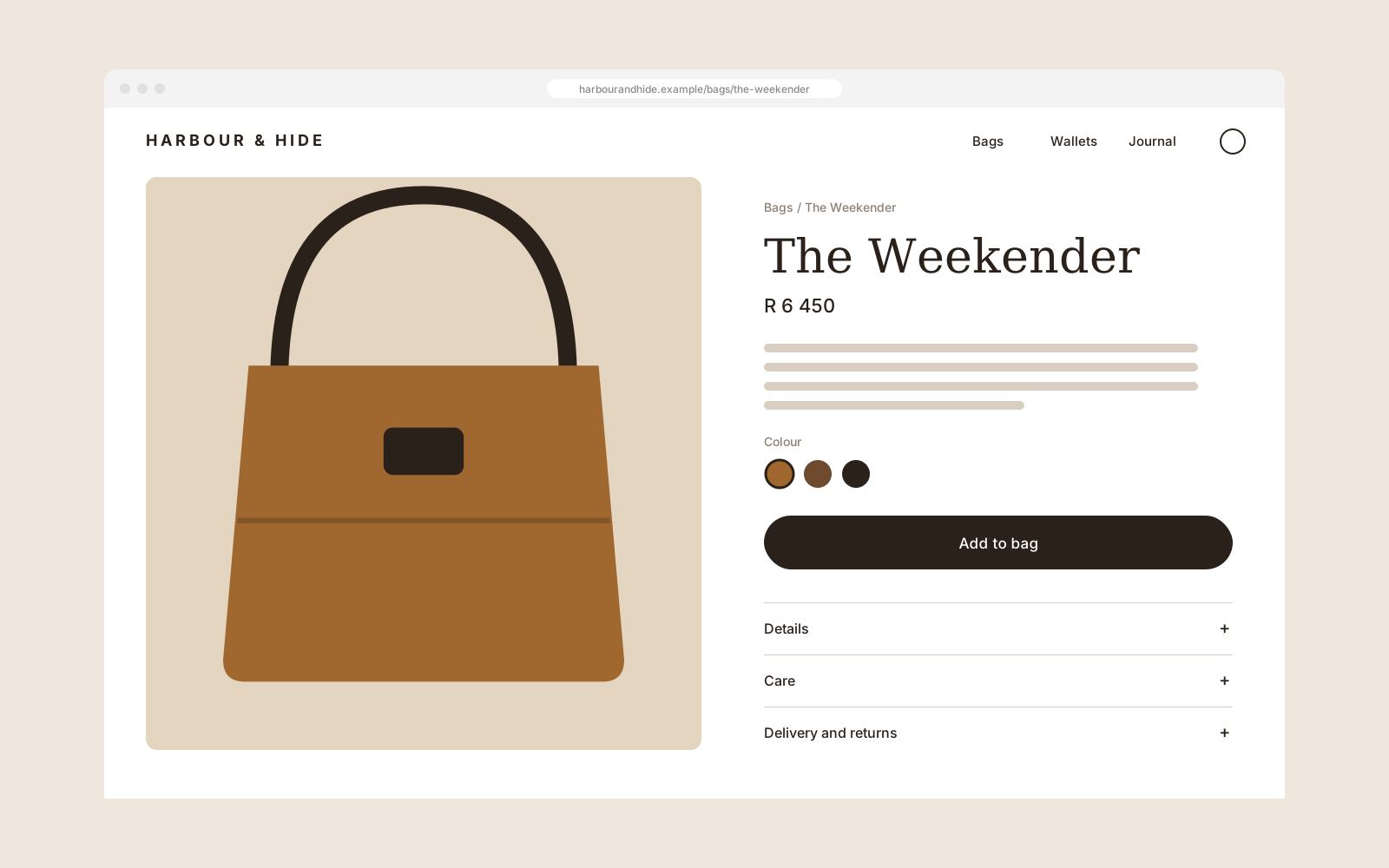
A storefront as considered as the product
Harbour & Hide · Luxury leather goods
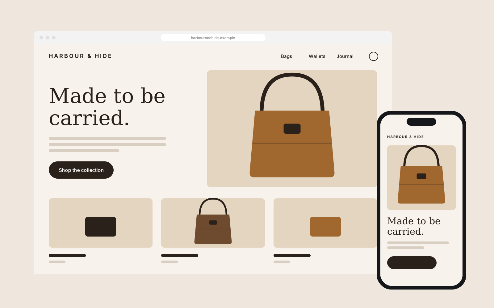
A made-to-order leather brand had outgrown a template store. We designed and built an online shop that slows down to show the craft, then gets out of the way at checkout.
- Service
- Web development
- Timeline
- 12 weeks
- Deliverables
- UX and interface design
- Online store build
- Product photography direction
- CMS and inventory setup
- Checkout and payments
The brief
Harbour & Hide make bags and small leather goods by hand in Cape Town. Most of their sales came through a market stall and word of mouth, and their online store was a lightly edited template that made a R6 000 bag look like a R600 one.
They wanted a store that felt as considered as the product, without adding steps between a customer and checkout.
What we did
We started with the questions buyers asked at the stall: how the leather ages, what fits inside, how long delivery takes. Those answers shaped the product page, which leads with large, honest photography and puts materials, dimensions and care up front instead of in a tab nobody opens.
The rest of the site stays quiet. A short collection page, a journal for the workshop’s stories, and a checkout trimmed to the fields that matter. We built it on a CMS the team can run themselves, so a new colourway goes live in minutes, not days.
The result
The store now matches the price point. Orders moved from the market table to the website, fewer people drop out at checkout, and the team spends their time making bags instead of editing templates.
It finally looks as good as the bags do. Customers tell us the site is what made them trust us with a big purchase.
Outcomes
- online orders, first quarter after launch
- 2.1×
- fewer abandoned checkouts
- 38%
- typical page load on mobile
- 1.2s
Illustrative figures for a sample project.
| Period | Value |
|---|---|
| Jan | 40 |
| Feb | 44 |
| Mar | 41 |
| Apr | 47 |
| May | 66 |
| Jun | 78 |
| Jul | 84 |
| Aug | 91 |
| Sep | 97 |